
If you have travelled to London you probably have encountered the tube map that is the schematic diagram representing the London Underground. The tube map is not only found on every tube station, but you'll often see it printed on coffee mugs, t-shirts or anything you can buy from a souvenir shop in London. In many ways the tube map has become a symbol of the city.
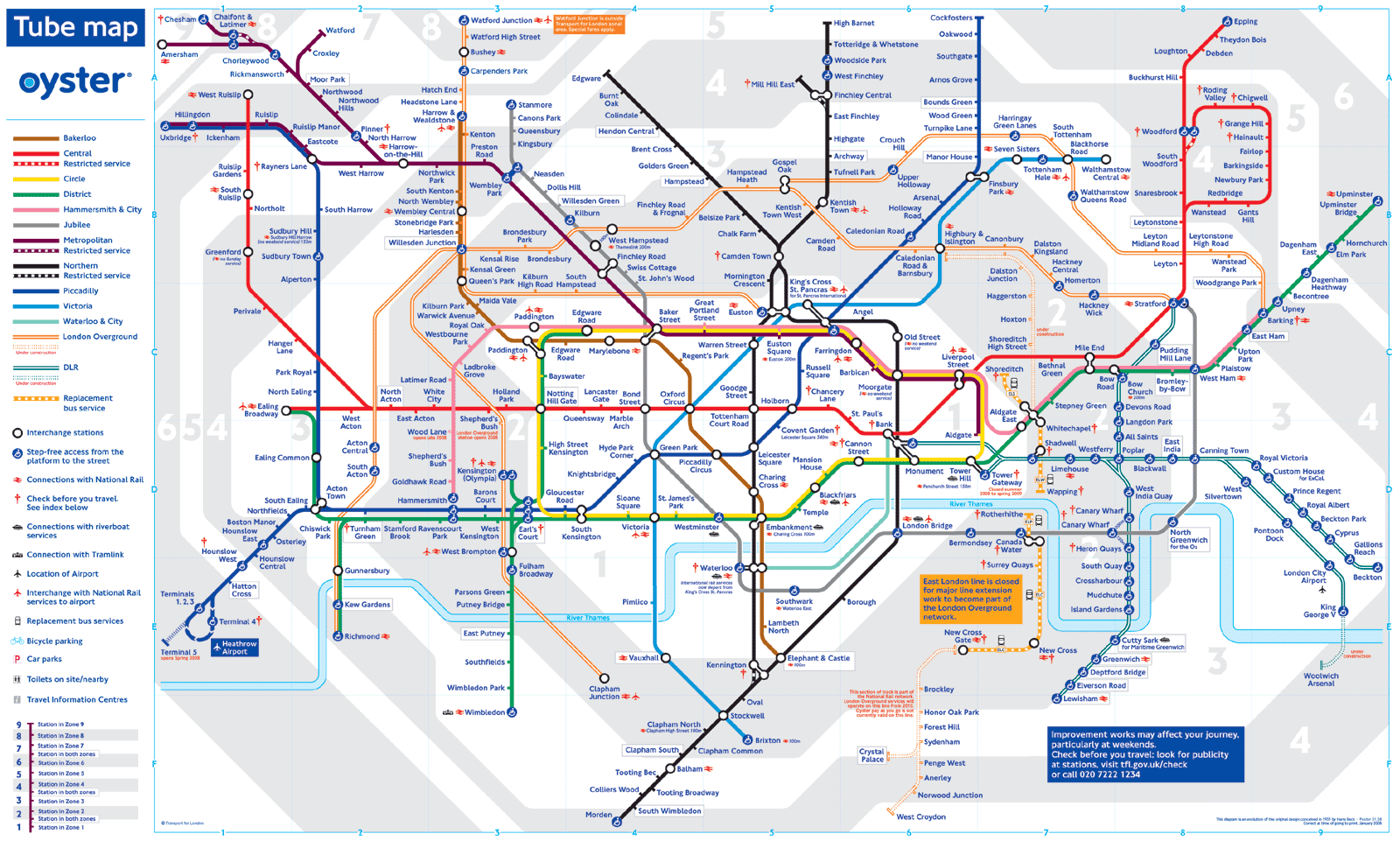
The tube map was designed in 1931 by Harry Beck, an Underground employee. This is the brilliance of his design: Beck was the first to realize that because the railway ran mostly underground, the physical locations of the stations were irrelevant to the traveler who wanted to know how to get to one station from another - only the topology of the railway mattered.
Here at 15m we're particularly fascinated by the way the tube map affects how people perceive London: The map has altered the travel patterns of Londoners and others by depicting some tube stations as closer to central London than they actually are and by sometimes giving the illusion that neighboring tube stations are far apart, when they're really located only a minute's walk apart.
BBC 4 has produced a 25-minute documentary on the visual design of the map. The documentary is well worth watching: