
Edward Tufte should be well known to many for his work (and books) on information design and visualization. The "Tufte-trio" (Visual Display of Quantitative Information, Envisioning Information and Visual Explanations: Images and Quantities, Evidence and Narrative) is a de facto canon for information design and have had large influence on the way we think about preparing information so humans can use it with efficiency and effectiveness.

In his latest book Beautiful Evidence (2006) he introduces the concept of Sparklines - defined as "small, high resolution graphics embedded in a context of words, numbers, images". These little data lines are small, high-resolution graphics that can be embedded in a context of words, numbers or images. According to Tufte, sparklines are "data-intense, design-simple and word-sized graphics".
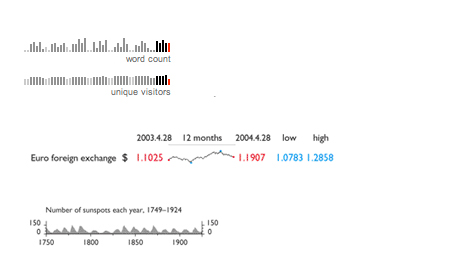
Sparklines from Beautiful Evidence by Edward Tufte (All rights reserved)
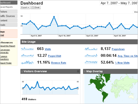
Sparklines used in Google Analytics reports
15m thinks that sparklines are intriguing and beautiful, and we see a lot of interesting possibilities for use. Their compactness makes it possible to present large datasets together, and their word-like simplicity and lightness makes it possible to integrate them closely with content without having the reader loosing the context or getting distracted. Interactive sparklines could also be used to enhance information and used as a trigger to explore datasets and details in relation to content.
Even though there exist various software for creating sparklines, and their simplicity makes them quite easy to build, they are still not commonly used. We've seen a few successul implementations, but would definitely like to see more!