
The world is full of statistical data - important data that should drive change and better understanding of the state of the world. But tables of statistics are dry, and often not very engaging to look at.
The WorldMapper project is an effort to make statistical data easy to grasp and compelling, or as they says themselves:"You can say it, you can prove it, you can tabulate it, but it is only when you show it that it hits home".
The project consists of a collection of world maps, where territories are re-sized on each map according to the subject of interest. In a map, the size of each country or geographic region is drawn in proportion to variables, like population size, wealth, infant mortality, energy use, or other things. There are currently nearly 600 maps covering a large set of subjects on Worldmapper.
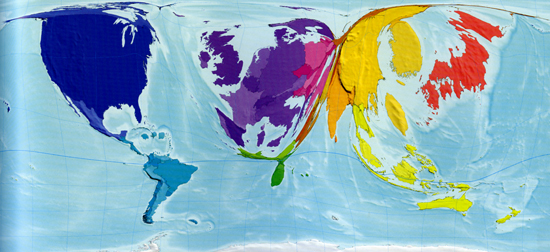
Internet users in 2002
The people behind Worldmapper are also responsible for the initiative SHOW/WORLD. SHOW/WORLD is an online informational tool launched in 2008 and is an extension of the Worldmapper project. SHOW/WORLD enables the users to interactively explore the maps, providing an even more immediate and engaging user experience.
15m is inspired by the clever use of information design presented by Worldmapper and SHOW/WORLD, and thinks that these maps are important eye-openers to the current state of the world.
Read more:
Frontpage: This map shows the worldwide distribution of people over 65 years old.